
Understanding the Importance of Mobile-Friendliness
In today’s digital landscape, the significance of mobile-friendliness cannot be overstated. With the advent of smartphones and tablets, internet usage on mobile devices has seen exponential growth. Recent statistics indicate that over half of all web traffic now originates from mobile devices, underscoring the necessity for businesses and content creators to adapt their strategies to cater to this audience. By making your site mobile-friendly, you not only enhance the user experience for the growing number of mobile users but also increase the potential for higher engagement and conversion rates.

Moreover, search engines such as Google have responded to this trend by implementing mobile-first indexing. This approach means that Google primarily uses the mobile version of a site for indexing and ranking purposes. Consequently, if a website is not optimized for mobile use, it may see a significant drop in search rankings. This can lead to reduced visibility in search engine results, ultimately limiting the reach of your content and its effectiveness in attracting a larger audience. Therefore, ignoring mobile optimization can adversely affect not just user experience but also your site’s overall performance.
Additionally, a mobile-friendly website typically results in lower bounce rates, as visitors are less likely to leave if the site is accessible and easy to navigate. Compatibility with various devices and screen sizes can increase the time users spend on your site, allowing them to engage with your content more effectively. In conclusion, prioritizing mobile optimization is no longer optional; it is a critical component of any successful online strategy.
Key Features of a Mobile-Friendly Site
Creating a mobile-friendly site is essential in today’s digital landscape where a significant portion of users access content through their smartphones and tablets. Several key features characterize successful mobile-friendly sites. One of the most critical aspects is responsive design. This design approach ensures that web pages adjust seamlessly across different screen sizes, providing an optimal viewing experience whether on a phone, tablet, or computer.
Another vital element is fast loading times. Mobile users often have limited patience; hence, a site that loads slowly can diminish user experience and increase bounce rates. Tools like Google’s PageSpeed Insights can help assess and improve loading performance. Streamlining images, reducing server response times, and minimizing code can significantly enhance speed.
Additionally, easy navigation is crucial. Mobile-friendly sites should utilize simple, intuitive navigation patterns to facilitate user interactions. Large buttons and well-organized menus make tasks easier and quicker, accommodating users with varying levels of digital literacy.
Furthermore, readable text without zooming is fundamental for mobile usability. Text should be appropriately sized, allowing for easy reading without the need for zooming in. The choice of colors and contrast also plays a significant role in readability, ensuring content is easily digestible under various lighting conditions.
Lastly, creating accessible content furthers inclusivity. This involves using alt text for images, ensuring compatibility with screen readers, and adhering to accessibility standards like WCAG. By considering these features, web developers can optimize their site to be mobile-friendly, ultimately enhancing the user experience.
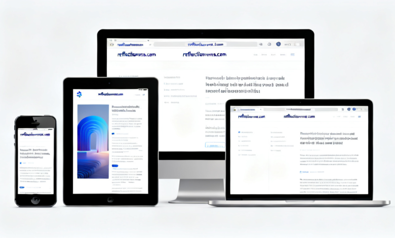
Responsive Design vs. Mobile Versions: Which is Better?
As businesses expand their online presence, an important question emerges: should you implement responsive design or separate mobile versions of your website? Both approaches aim to make your site mobile-friendly, yet they differ significantly in execution and user experience.
Responsive design utilizes fluid grids and flexible images to ensure that a website adapts seamlessly to various screen sizes and orientations. This approach provides a unified experience across devices, as the same code serves both desktop and mobile users. Among its advantages, responsive design simplifies maintenance, as only one version of the website requires updates or changes. Additionally, search engines, including Google, favor responsive design, which can enhance your search rankings.
On the other hand, creating separate mobile versions involves developing an entirely different site tailored specifically for mobile users. This approach allows for greater customization and can be optimized to improve loading speeds on mobile devices. However, the maintenance of two distinct sites can be resource-intensive, and inconsistencies between the two versions may confuse users. Furthermore, the presence of multiple URLs can complicate SEO strategies.
Each option has its pros and cons, and the best choice ultimately depends on your specific business goals and target audience. If your site requires extensive customization for mobile users or if your audience primarily engages via mobile, a separate mobile version may thrive. Conversely, for brands seeking consistency and ease of management, a responsive design might be the preferable direction.
In conclusion, assessing your goals and analyzing user behavior are critical in determining which strategy will effectively make your site mobile-friendly while catering to your audience’s needs.
Optimizing Images and Media for Mobile Devices
In the digital age, ensuring that your website is visually appealing on mobile devices is of paramount importance. One of the key components in achieving this is by optimizing images and media files. High-resolution visuals are essential for engaging users, yet they often contribute to slower load times if not properly managed.
Image compression is a fundamental technique for enhancing the performance of your mobile site. Tools like TinyPNG, ImageOptim, or online alternatives can significantly reduce image file sizes without sacrificing quality. It is vital to strike a balance between image quality and file size; high-resolution images that take too long to load can frustrate mobile users and lead to higher bounce rates.
When selecting image formats, it is advisable to use formats that are optimized for the web. For instance, JPEGs are typically best for photographs, whereas PNGs excel for images requiring transparency. Additionally, consider using newer formats like WebP, which offers superior compression, allowing for faster loading times while maintaining high-quality visuals.
Responsive design is another crucial aspect of media optimization. Ensure that images and videos adapt to different screen sizes by using CSS techniques like media queries. This ensures that users experience a well-structured layout, regardless of the device they are using. Implementing srcset and sizes attributes in your image tags helps define the appropriate image resolution for varying screen sizes, significantly enhancing load times and user satisfaction.
Lastly, consider incorporating lazy loading for images and videos that are not immediately visible when the page loads. This technique can delay the loading of off-screen media, speeding up your main content’s delivery. By taking these measures, you can make your site mobile-friendly, ensuring that images and other media create a seamless experience for users across all devices.
Enhancing Website Speed for Mobile Users
The speed at which a website loads is a critical factor for user experience, especially for mobile users who often operate on varying network conditions. A swift-loading site not only enhances user satisfaction but also positively impacts search engine ranking. Thus, optimizing your site to improve loading times should be a priority.
One effective method to enhance website speed is through the minification of HTML, CSS, and JavaScript files. Minification involves removing unnecessary characters such as spacing, comments, and formatting from the code without affecting its functionality. By reducing the file size, the loading time can significantly decrease, making your site mobile-friendly.
Additionally, the implementation of caching mechanisms is essential. Caching allows frequently accessed data to be stored temporarily, which enables quicker retrieval upon subsequent visits. By using browser caching, you can instruct browsers to store certain files locally, minimizing the need for repeated downloads. This results in a considerable decrease in loading times for returning users.
Another strategy to consider is utilizing a Content Delivery Network (CDN). CDNs work by distributing your website’s content across multiple servers located in various regions. When a user accesses your site, the CDN delivers the content from the nearest server, significantly reducing latency and improving load times, particularly for mobile users accessing your site from different geographical locations.
To assess the effectiveness of these strategies, it is important to test your website’s loading times regularly. Tools such as Google PageSpeed Insights or GTmetrix can provide valuable insights and highlight areas for improvement. By continuously monitoring and optimizing your website speed, you can ensure that your site remains accessible and efficient for mobile users.

Creating Mobile-Friendly Navigation
Designing effective website navigation for mobile devices is crucial for enhancing user experience. As mobile usage continues to rise, it becomes paramount for webmasters to adapt their navigation systems to suit smaller screens. A key principle is to simplify menus, as complex navigation can overwhelm users. Consider using a hamburger menu, which allows users to expand a compact menu when needed, keeping the primary interface clean and user-friendly.
Additionally, button size and spacing play a significant role in creating mobile-friendly navigation. Larger buttons with adequate spacing help prevent accidental clicks, which can occur when navigating on smaller devices. Ideally, touch targets should be at least 44 pixels wide to ensure ease of use. This approach not only enhances usability but also encourages user engagement, as visitors can navigate effortlessly without frustration.
Furthermore, integrating a search feature on your mobile site can greatly improve navigation. A prominent search bar allows users to find specific content quickly, bypassing navigation menus entirely. This feature is particularly useful for users who may want to locate particular articles or products without sifting through multiple categories. Implementing an efficient search function will cater to diverse user preferences and streamline the overall browsing experience.
Overall, by simplifying menus, ensuring button usability, and adding a search feature, you can significantly enhance the mobile navigation of your website. These strategies will not only make your site mobile-friendly but also foster a more enjoyable and seamless user experience that can lead to increased engagement and satisfaction.
The Role of Content in Mobile Experience
When developing a mobile-friendly website, the structure and form of your content play a critical role in enhancing the user experience. Creating content tailored for mobile users involves acknowledging the constraints posed by smaller screens and limited attention spans. As a result, it becomes imperative to focus on concise writing. Engaging users quickly and effectively while providing them with essential information is key to retaining their interest.
Clear calls-to-action (CTAs) are fundamental in guiding visitors toward desired actions, such as signing up for a newsletter or making a purchase. Whichever action you want users to take, ensure that your CTAs are not only visible but also compelling. Use contrasting colors and prominent placement to draw attention to these buttons. Furthermore, the phrasing of your CTAs should be clear and direct, enabling users to understand what is expected of them with minimal effort.
For mobile users, the process of scanning content is prevalent. To facilitate this behavior, the strategic use of headings and bullet points is essential. Headings break the content into manageable sections, allowing users to quickly identify the information they are seeking. This method not only improves the readability of your content but also enhances its overall structure. Bullet points can effectively present information in a digestible format, highlighting key aspects without overwhelming the reader.
In essence, optimizing your content for a mobile context involves deliberate choices that bolster content clarity and accessibility. Engaging your audience through concise text, prominent CTAs, and well-structured formats fosters a mobile-friendly digital environment. By prioritizing these elements, you significantly enhance the likelihood that users will interact with your site positively, fostering a seamless user experience.
Testing and Analyzing Mobile-Friendliness
To ensure that your website is effectively optimized for mobile devices, it is crucial to implement comprehensive testing and analysis methods. One of the primary tools available is Google’s Mobile-Friendly Test. This tool allows you to enter your website’s URL and assess its compatibility with mobile devices. Google provides clear feedback on any issues that may hinder mobile usability, such as text size that is too small or elements that are too close together, which can impede user interactions. By correcting these issues, you can significantly enhance user experience for mobile visitors.
Additionally, utilizing analytics platforms such as Google Analytics can provide insights into mobile user behavior. By examining metrics such as bounce rates, session duration, and page load times specifically for mobile users, you can identify any potential areas for improvement. In particular, monitoring how mobile users engage with your site offers valuable information on how effectively your pages function on smaller screens. Leveraging these insights may lead to better navigation, content layout, and call-to-action placement.
Another effective method of testing your website’s mobile-friendliness comprises usability testing. This can involve recruiting real users to interact with your site on various devices, allowing you to gather feedback on their experiences. Observing how users navigate your website can reveal practical insights into usability issues that might not be apparent from automated tests alone. Adjustments based on actual user feedback can help tailor your site’s mobile experience to better meet visitors’ needs. By combining these testing tools and methods, you can systematically make your site mobile-friendly and improve overall user satisfaction.
Future Trends in Mobile Website Optimization
As we move further into an era dominated by mobile technology, the significance of mobile website optimization continues to grow. Upcoming trends in this field will likely focus on several key areas that promise to enhance user experiences and improve site performance. One of the most notable advancements is the integration of artificial intelligence (AI) across mobile platforms. AI technologies are increasingly being used to personalize content and improve user navigation, ensuring that users have a seamless and intuitive experience.
Another pivotal trend is the rise of Progressive Web Apps (PWAs), which combine the best features of both websites and mobile applications. PWAs offer faster load times, offline functionality, and improved responsiveness, making them a compelling choice for businesses looking to enhance their mobile presence. As these technologies evolve, they will play an integral role in making sites mobile-friendly.

Responsive design continues to be vital as companies aim to provide optimal viewing experiences across a multitude of devices. Keeping abreast of the latest improvements in CSS and HTML frameworks can be beneficial for web developers aiming to optimize their mobile sites. Additionally, the implementation of voice search functionalities is on the rise. With the growing use of virtual assistants, optimizing content for voice search is becoming essential for ensuring visibility in search engine results.
Moreover, as mobile internet speeds increase with advancements in 5G technology, it enables richer content experiences without sacrificing load times. This will likely lead to an increase in multimedia use, such as high-definition videos and interactive elements on mobile sites. To thrive in this rapidly changing environment, businesses must remain vigilant about these trends and continually adopt strategies to make their sites mobile-friendly.
Also read reflectionverse.com
Email: johanharwen314@gmail.com
Author Name: Johan Harwen